
3/11/2005
Visual Design in Prose
I'd like to try something a little unorthodox here.
I'd like to try to explain something about writing by talking about drawing. Don't worry -- it isn't a painfully drawn out, clumsily symbolic allegorical exercise or a quaint Zen parable or a cute gimmick for familiar pedantry.
Instead, it's as literal as words on paper.
When Vocations Collide
I was raised to be a visual artist. That is, when I demonstrated an interest in drawing at an early age I was enrolled in private classes. My parents bought me supplies and materials appropriate to the craft: pencils, papers, paints. In short, I was encouraged.
I was just a little kid. I didn't know any better. I said the little kid equivalent of, "Okay, folks. If you're sure this is my first, best destiny then I'll give it the old college try."
And I did. I went to a school for the arts, like Fame, and served as apprentice to a short, opinionated Sicilian oil-painter. I drew from life and painted from mind. When the time came I packaged up a portfolio and sent it away to art college. "Welcome aboard," they replied, sending along instructions for who to make the cheque out to.
So I became a professional commercial artist. Which is okay, I guess. I mean, it pays the bills.
But not very long ago I discovered that I love to write. This discovery came about two years ago, and I've been writing quite a bit since then. By now it is clear in my mind that if I had my 'druthers I'd just make up stories all day long. To do so takes me away to the same vital, immersive space as visual art does.
I craft my stories like visual art, too. I think of them in pictorial terms, and make editorial decisions based on how the text looks on the page.
Listen, and I'll explain how it works.
The Squint
Proportion is important. Of this much the Ancient Greeks were sure. They started making buildings modelled after human anatomical relationships, and people liked the buildings. They'd stumbled on to something big: human beings can recognise patterns familiar from nature in any media. (It's the beginning of the road that leads history to Phi.)
Painters and sculptors manipulate the proportions of visual elements to create arrangements that (wittingly or unwittingly) satisfy the principles of formal visual design, using lightness and darkness to create the psychological illusion of weight, and thereby create a composition that is considered "balanced."
This remains true even in a highly abstracted work which may depict no literal space. Even so, the viewer's mind lends mass and direction to the composition, causing it to feel the tension of gravity. The artist can only fight the viewer's desire to rationalize the imaginary space to a limited point -- beyond this, it can only be succumbed to. Even unreal things must conform to the laws of reality if the viewer is to accept them.
That is to say: if it isn't real, it should at least rhyme with reality. (I've mentioned this before.) It's a matter of pattern, not content.
An artist working at an easel often stands back to squint at their work. Squinting blurs out the details and reveals only the broad strokes, reducing any composition to its naked elements of mass. It is in this way that they judge whether the visual elements have the proportions they need in order to feel right.
The visual rhythm stands out against the noise of detail, making apparent to the squinting artist the underlying structure of the composition.
So, trained to draw, my first instinct in writing was to find a way to squint at it.
Between the Lines
I have no rules for you, but I do have clues.
Much like writing itself: it is not a recording of a voice so much as a series of carefully arranged hints to reproduce it. The voice tells a story, and it tells it in a certain order and with a certain tempo. The author cannot control the voice in your head recounting the narrative to you from the page, but they can contrive its cues and thereby hope to influence it.
The most basic cue is timing. In prose, timing is expressed on the grossest level by paragraphing. This is where the literary squint really shines.
In art we are often instructed when squinting to attempt to defocus the elements of our composition itself, and see instead the so-called "negative space" surrounding them. For instance, in a picture of a red flower on a yellow background, the negative space would be the yellow squarish shape with an anti-flower shaped hole in the middle of it. If your picture is yin, it's the yang. It your picture is yang, it's the yin. You can't have one without the other.
In writing, the negative space is the paper itself.
If you squint at a page covered in the written word you can see a visual precis of the grossest unit of timing in a given block of prose. You can also glimpse a second and third tier of timing: phrase length reveals itself because of characteristic reoccurance of the wider negative space covering the top of a period or comma and the carriage advance that follows, and word length reveals itself through simple density of ink. With one smudgy squint, the essential rhythm of the prose is laid bare.
Whatever other devices a work may employ to influence the reader's notion of time and tempo, they would strain to override the fundamental sense of flow imparted by the mechanical aspects of the telling. Beneath and before all else, the written word encodes the experience of a human being recounting a story to other human beings -- the written word encodes a human voice, complete with pauses for breathing and drama.
...Breathing and drama expressed via the paper between the typographical marks.
Squinting can reveal the stepped structure of a slow introduction or the build of a complex argument or description. Squinting can reveal a loose paragraph that the reader's eye gushes through like water, when it should be digesting each morsel of information slowly, hemmed and blocked in by dams of the proper verbal density. Squinting can reveal a passage too dense for Dostoevsky, or too haphazardly random to possibly lull a reader anywhere.
Go open your favourite book right now, and squint through the first chapter. What kind of a rhythm does it have? Now squint through the last chapter, and note the symmetries and disparities.
This is like the opening and closing of a symphony, telegraphing the theme in sub-layers for harmony and glue. This tells you what kind of story you're being told the same way as the look on the face of a speaker as they begin and end an oral telling. Is this a rant or a romance? A confession or an ode? A recounting of connected thoughts, or staccato actions?
Squinting doesn't lie.
Music of the Spheres
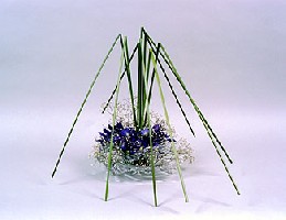
In Japanese Ikebana floral design the three major classes of scale (tallest, medium, smallest) are called Shin, Soe and Hikae. It understood by master arrangers that the proportions given to these three tiers will either ring true with the proportions of nature, or fail. It is understood that a human concept of beauty is founded on these proportions, neurologically hard-wired to the guts.
This is why the same ruler of proportions can be used to sub-divide Sogetsu sculptures, or Michaelangelo's David, or the Parthenon, or the face of a very pretty girl.
Aristotle was so sure this was true he thought the cosmos reverberated with the harmonies of divine proportions, the music of the spheres. Pythagoras believed that understanding the rhythm of scale was a way into the minds of the gods. The Buddha structured his paths and Way so, tailored after nature.
Consider the authority Beethoven's 5th Symphony would lack if it opened with a blending of notes, rather than stamping each out in passioned lockstep.
And so, when your eyes are bleary from re-reading your drafts, reworking themes and devices and turns of phrase, consider this: try just having a good squint at it. Lay your printed pages end to end vertically to create a continuous stack -- a graph of textual density in a column...
Ask yourself: do the denser parts fall into a natural, pleasing arrangement? Or is it all Shin?
Subscribe to:
Post Comments (Atom)
No comments:
Post a Comment